It’s not the destination that matters—it’s the journey.
Or so they say. While this adage may be true for most things in life, in the case of ecommerce conversions, the journey (a fast checkout experience) is just as important as the destination.
If a shopper decides to change their course and leave a full cart behind, you’ll be missing out on not just a sale—but a potential new customer.
Unfortunately, the checkout page holds the greatest risk of losing sales. It’s estimated that the average shopping cart abandonment rate at the checkout page hovers somewhere between 65% and 96%, dependent on industry.
Want to ensure customers reach their destination? Here’s how to reduce friction, create accelerated checkouts, and ensure your customers complete their shopping journey.
The current state of ecommerce checkout experiences
Yes, site speed is important to conversions (more on that below), but increasing conversions isn’t just about providing faster checkouts; it’s also about removing any friction when it’s time for a customer to provide their payment details. In fact, problems at checkout are one of the top reasons shoppers fail to complete a transaction.
In 2019, online fraud prevention platform Forter surveyed 2,000 US shoppers. What it found was that 30% of respondents will abandon their cart if asked to re-enter their credit card number, and 25% will do the same if they have to re-enter their shipping info.
Although asking shoppers to enter information more than once may be intended to prevent fraud, it creates friction in the shopping experience—and adds time to the overall transaction. This last point is key: during the same survey, 50% of US shoppers indicated they were less likely to buy something online if the entire checkout process took more than 30 seconds.
Meanwhile, a wait of longer than 10 seconds for a credit card to be processed or longer than 12 seconds for shoppers to receive their confirmation email can make them wary of a site’s authenticity. Roughly 92% of consumers have concerns about purchasing from unfamiliar websites, and slow page load time—particularly when financial details are involved—can contribute to this. That’s why one of the best ways to improve the checkout experience is by improving your site speed.
“Shoppers expect instant gratification,” said Forter CEO Michael Reitblat in a press release. “That’s why being able to confirm the trustworthiness of a customer automatically without making them jump through hoops is essential for ecommerce merchants looking to beat out the competition.”
How to reduce friction and speed up the ecommerce checkout process
Optimize your site for international visitors
Customers are most comfortable purchasing from sites that feel familiar, including stores that display information such as language, currency, and payment options. In fact, one recent study indicates that more than 40% of Europeans never purchase products and services in a language other than their own.
Optimizing your store for international visitors is easy with Shopify, which allows for up to 20 languages, 133 local currencies, and local payment methods such as Klarna, Klarna, Sofort, iDEAL, and Bancontact.
Reduce the number of form fields
Although experts will argue about what exactly the optimal checkout process looks like (it may be affected by the category of goods you sell or your target demographic), there’s one thing most can agree on: when it comes to form fields, less is more.
UX research experts at the Baymard Institute surveyed users in 2021 and found that 18% will abandon their cart if the checkout process is perceived as being too long or complicated. That’s one out of every five shoppers.
The number one factor contributing to this perception? No, it’s not the number of checkout steps. (That is, provided you have less than eight, which may affect conversions. For the record, the average number of steps hovers somewhere around five or six.) It’s the number of form fields. Baymard found that the average checkout contains nearly 15 form fields, which is twice as many as it determined merchants need.
“During testing we consistently observe that users are overwhelmed and intimidated when seeing a high amount of form fields and selections,” write the study’s authors. “When working on simplifying the form and form appearance, it’s important to remember that even optional fields add friction to the checkout flow.”
Baymard found that most sites can achieve a 20% to 60% reduction in the number of form fields displayed by default by cutting the number of fields down to six to eight. Its top three recommendations were to collapse your address line two and company name behind a link; use a single “Full name” field; and set the “Billing address = Shipping address” by default.
Another form you should eliminate is mandatory sign-ups or site registrations before the payment is made. Baymard recommends making “guest” checkouts the most prominent option or the default, as usability studies have found that users are more likely to abandon their carts when asked to sign-up before checkout.
This is the time for payments, not for building relationships. On that note, only ask for a phone number if absolutely necessary and be sure to indicate how it may be used (such as to confirm shipping details). A study of 2,800 online shoppers found that 14% won’t provide their phone number to complete a checkout.
You may also choose to use an accordion design feature to hide fields, which may reduce the user’s feeling of being overwhelmed, or consider adding a progress bar. All of these changes will lead to more frictionless checkouts and faster checkouts.
Demonstrate your trustworthiness
The main reason customers walk away from a full cart? Checkout is when you ask them to disclose and provide sensitive information, such as credit card details. Fail to prove you’re trustworthy and you could lose the sale.
During Baymard’s 2021 Checkout Usability study of over 4,000 American adults, 17% revealed they’d abandoned a checkout flow in the last three months because they “didn’t trust the site with their credit card information.
Particularly for first-time customers, establishing your store as secure is key to conversions. Providing a speedy checkout may help, as may ensuring shoppers feel comfortable entrusting you with their payment information.
On your checkout page, consider including credit card logos, seals or badges of authenticity, as well as links to your privacy policy, shipping details, FAQ, and returns policy. You may also choose to reinforce the credit card field visually, by using background colors or shading, which Baymard explains improves the perceived security of the field. Finally, validate the credit card number and auto-format spaces in the credit card field; both are small changes that have been proven to increase conversions.
Save customer information and autofill it for them
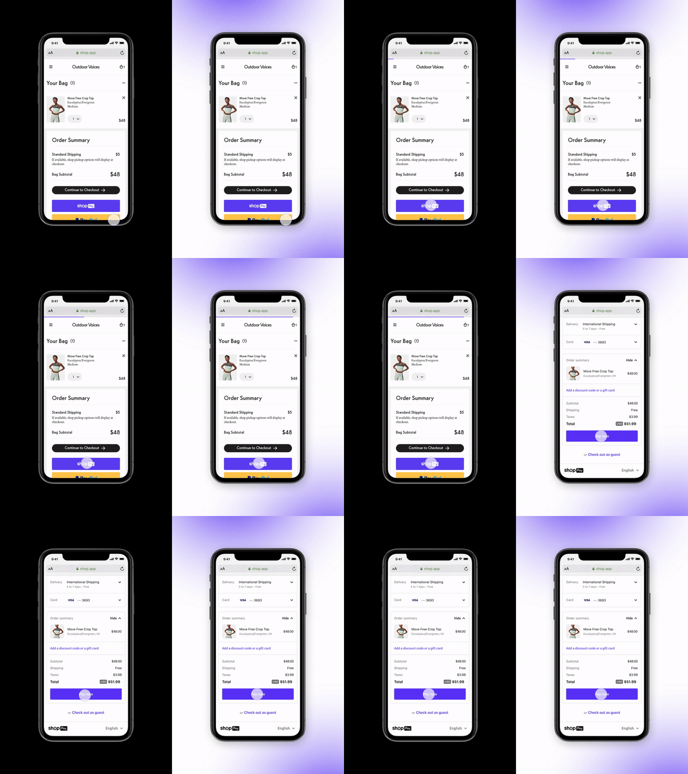
Google AutoFill can help create a frictionless checkout, but it’s even easier to implement this recommendation with Shop Pay, which increases the checkout speed by 60%. When a verified Shop Pay user reaches your checkout page, their personal information will populate instantly after entering a security code.
This simple step can make a huge difference. In a 2020 Shopify study of the 10,000 largest Shopify merchants with Shop Pay enabled, we found that Shop Pay checkouts have a 1.72 times higher checkout-to-order rate than those going through regular checkouts. This rate increases even more—to 1.91 times higher—for mobile users.
“The majority of our customers today are discovering new products on the go on their mobile devices, and if they have to fill out a form, we’ve lost them," Benjamin Sehl, co-founder of Kotn, a sustainable clothing retailer, told the Shopify team in 2020. “Enabling Shop Pay in our checkout has really made the most painful point of the customer experience delightful, and since it’s tied into the million-merchant ecosystem, even new customers can check out in one click.”
Enabling Shop Pay is also proven to increase frictionless payments on third-party shopping platforms, such as Facebook and Instagram.
What are the benefits of creating fast checkout experiences?
Our research shows that adding Shop Pay as an option to your store pays in dividends. Here’s how:
Higher conversions and optimized social selling
We’ve seen ecommerce stores like Muddy Bites convert customers at an incredible rate using accelerated checkout experiences.
“We have a one-click checkout system that has a very high conversion rate with extreme growth,” says Jarod Steffes, co-founder and CEO at Muddy Bites. He reports that from 2019 to 2020, the company experienced a 1,167% year-over-year growth.
Shop Pay provides a seamless option for completing purchases on your mobile and desktop site, as well as through checkouts on Instagram and Facebook.
Learn more: 15 Conversion Rate Optimization Strategies from the Top Fashion Brands
Increased brand rediscovery
Every time a customer completes a purchase using Shop Pay, they’re provided with the option to track their orders in the Shop app. The ability of customers to track their order status and delivery updates on their phones means less support is needed from your team to answer easy but time-consuming messages like “Where’s my order?”
Not only that, but regular push notifications create brand moments, extending the relationship beyond the point of checkout, and making every touchpoint from checkout to delivery an opportunity to rediscover your brand.
Learn more: 5 trends for the future of ecommerce: Brand building challenged by marketplace dominance
More repeat purchasers
The Shop app shows users recommendations from the merchant within the shopping feed in the app. That means Shop is always helping you make your next sale before a customer’s last order has even arrived.
As just one example, Muddy Bites achieved an 8% increase in completed return customer orders since it started to use Shop.
Learn more: Increase Conversion, AOV and Repeat Purchase with Shipping and Returns Apps
How to get started with Shop
We know how important a frictionless checkout process is to your bottom line. It’s why we created the most powerful accelerated checkout in the world: Shop Pay.
Brands like Allbirds, Kith, Beyond Yoga, Jonathan Adler, Loeffler Randall, and Blueland are already taking advantage of Shop Pay. That’s because, on average, Shop Pay has an average of 9% lift in conversion for all checkouts, and a 18% higher conversion rate for returning customers, and our latest speed improvements make payments and conversion even faster.

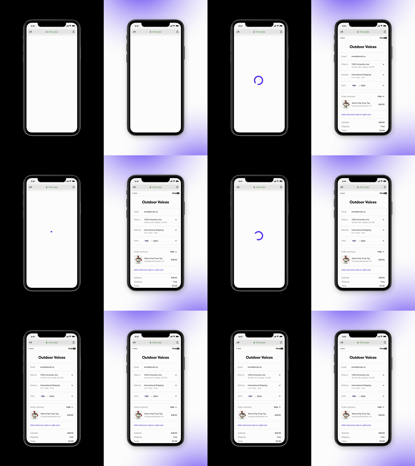
The time it takes to autofill Shop Pay customer forms has gone from 3.3 to 0.7 seconds. The total time to load has decreased from 7.4 to 4.7 seconds.

Shop Pay makes the checkout experience so much easier and faster. It helps us reduce the friction from shopping cart to completed sale and ultimately delivers a much better experience for our customers."
—Muddy Bites

Want to try it out for yourself? Getting started is easy:
1. Add the Shop channel. From your Shopify admin, navigate to Sales Channels, click Shop to learn more, and click Add the Shop Channel.
2. Enable Shop Pay. After you have chosen how you would like to sign in with Shop, tap Set up Shop Pay and follow the prompts. Don’t forget: you can update your Shop Pay information at any time on the Profile tab by tapping Shop Pay.
3. Enable Track with Shop. All the information your customers want at their fingertips, from notifications to order details in real time. Add the Track with Shop option at checkout by activating it in your admin.
4. Customize your store profile and product listings. You can customize many parts of your store profile, including logo, cover image, meta description, links to store URL, contact page, and social media links. From your Shopify admin, go to Sales channels > Shop. Click Edit profile to make changes.
Read more
- Guest Checkouts: Definition, Benefits, and Best Practices
- One-Page Checkouts: Definition, Benefits & Optimizations
- 12 Checkout Process Optimization Tips to Increase Ecommerce Revenue
- 11 Ecommerce Checkout Best Practices: Improve the Checkout Experience and Increase Conversions
- What 1-Click Checkout Can Do for Your Small Business
- How to Optimize Your Mobile Checkout Flow
Making Ecommerce Checkout Faster FAQ
How can I make my checkout faster?
-
Streamline the checkout process: Make sure the checkout process is as simple and straightforward as possible. Reduce the number of steps, simplify the forms and make sure all the elements are clearly labeled.
-
Show the checkout progress: Let customers know how far along they are in the process by showing a progress indicator. This helps them understand what step they’re on and how much more work is needed to complete the checkout process.
-
Offer multiple payment options: Provide customers with a variety of payment methods to make it easier for them to pay.
-
Offer a guest checkout option: Enable customers to make a purchase without having to create an account. This reduces the amount of information they have to provide and speeds up the process.
-
Offer order summaries: Show customers a summary of their order before they complete the checkout process. This helps them double-check their order and ensure they’ve selected the right items.
-
Let customers save payment methods: Allow customers to store payment information so they don’t have to enter the same information each time they make a purchase.
-
Use auto-complete technology: Utilize auto-complete technology to make it easier for customers to fill out forms. This can help speed up the checkout process. If you’re a Shopify merchant, activating Shop Pay on your store will allow customers who have a Shop Pay account to checkout with one tap. It allows them to store credit card, email, shipping and billing information and then use it to autofill checkout fields on return visits to your website.
-
Provide real-time shipping estimates: Offer customers an accurate estimate of when their order will arrive and what shipping options are available. This helps them understand the time frame and makes them more likely to complete the purchase. If you’re a Shopify merchant, you can activate Shop Promise—a tool that automatically displays expected delivery dates, intelligently predicted by Shopify, on your store’s product pages, checkout, and in the Shop app.
Does fast checkout work on Shopify?
Yes, Shopify offers fast checkout (or accelerated checkout) options. Shopify merchants can enable payment providers that offer an off-site checkout, like Apple Pay or Google Pay, which can make the checkout process faster and easier for customers. Accelerated checkout buttons can show on the storefront, or the first step of checkout, to allow customers to use one of these off-site checkouts. Merchants can also activate Shop Pay, the world’s highest-converting one-tap checkout.
Why is fast checkout important?
Fast checkout is important because it allows customers to quickly and easily complete their purchase. This makes customers more likely to complete the checkout process and less likely to abandon their cart. A fast checkout also helps to drive conversions and improve customer satisfaction, as customers will be able to quickly and efficiently complete their purchase. Additionally, streamlining the checkout process can help to reduce transaction costs and increase the speed of service, leading to a better overall customer experience.


