Whether by an innocent user-error or broken links on a website, it’s inevitable that visitors to client’s stores will occasionally land on 404 error pages. While seeing a 404 page may not be an expected action, it doesn’t mean that the end result needs to be a frustrated visitor.
These pages can also be an opportunity to provide support with an on-brand message, and some of the best 404 error pages combine humour with good UX to create memorable experiences .
.
Website developers should be mindful of this when creating custom themes for clients, and including user-friendly, appropriate, and well designed 404 error pages is important for reducing customer effort. By connecting functional features like clear call-to-actions, search boxes, and navigation with creative and amusing imagery, developers can craft personalized landing pages, and turn a possible negative event into a positive one.
In this post, we’ll look at some examples of inspiring 404 pages, as well as how to get started with creating custom 404 pages on Shopify, so that you can improve your client's themes and empower them with personalized pages.
You might also like: Microcopy: Why Tiny Words Matter.
Best practices for 404 pages
A good 404 page should indicate an error has taken place, provide clear navigation to a more suitable page, and be consistent with your client’s brand. There can also be SEO impact, since a well-designed page loaded with helpful links will reduce the bounce rate, and engaging or funny content might even increase time spent on this page.
Even Google Support has some very enlightening advice for working with 404 pages.
“If you have access to your server, we recommend that you create a custom 404 page. A good custom 404 page will help people find the information they're looking for, as well as providing other helpful content and encouraging them to explore your site further.”
“If you have access to your server, we recommend that you create a custom 404 page. A good custom 404 page will help people find the information they're looking for, as well as providing other helpful content and encouraging them to explore your site further.”
Even with a branded, custom 404 template, it’s still important to check a site for broken links, to minimize the chance of customers being misdirected. A simple tool like W3’s Link Checker or the app Transportr can allow developers to quickly identify and fix any 404 events on their client’s stores.
The movement away from generic 404 pages has become standard practice , and this allows clients to present their brand in the best possible light, while funneling customers back to the main site. Here are some examples of particularly well designed 404 error pages, which can inspire you to develop unique pages for your clients.
1. Github
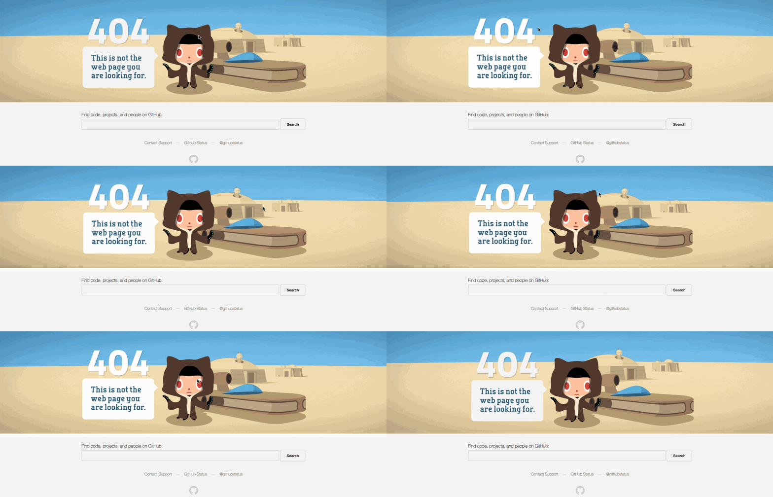
 By employing humor and pop culture references, Github delivers a funny message that defuses any awkwardness when landing on this error page. The navigation options are simple, to avoid any confusion, with a search bar and links to support and a status page.
The coup de grace, however, is the subtle parallax effect, that makes the image react in a playful way with a user's cursor. This easily-overlooked animation shows that GitHub’s designers are very intune with their audience, as they know that this “easter egg” will be admired by the developer community.
2. Codecademy
 Programming school Codecademy takes an educational approach to 404 pages, with a clever link to learning more about HTTP errors. A comprehensive footer also provides an easy route to site content and course resources.
3. Backcountry
 A perfect example of a 404 page in an ecommerce context, outdoor apparel brand Backcountry has a lush landing page, with a full-screen image and an on-brand joke. The message of the page apologizes and accepts responsibility, but in a positive and upbeat way.
4. Dropbox
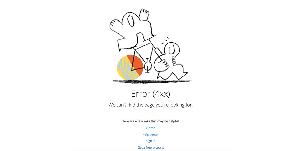
 Dropbox’s iconic illustration style is the centerpiece of this simple error page, where carefully picked imagery again plays a key role in boosting brand awareness. A professional tone compliments the sketch, and a minimal number of links gives the user options to navigate to safety.
5. Keir Whitaker
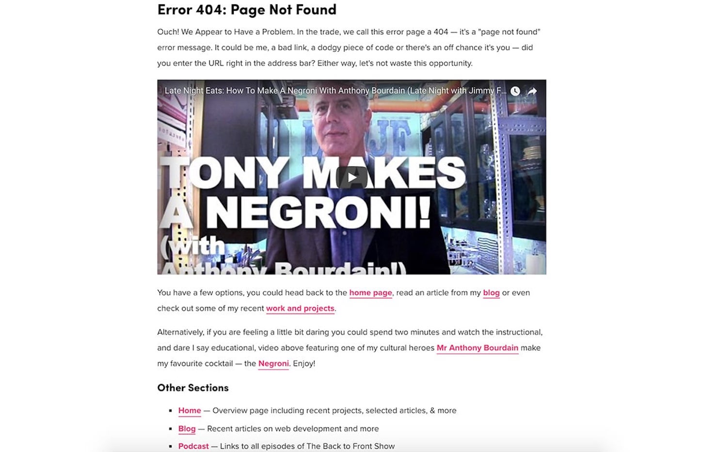
 Shopify’s own offline marketer and developer advocate, Keir Whitaker, has a very comprehensive error page, outlining what a 404 page is, how a visitor might have arrived here, and offering up an instructional video on how to make a Negroni, Keir’s favorite cocktail. An ample number of links including his web development blog and podcast, completes this functional, yet fun page.
Customizations you can make to Shopify 404 pages
If you’re tweaking a theme for a client, using a default Shopify 404 page is a workable solution, provided you’re working with an approved theme from our theme store.
It’s worthwhile, however, to consider how bespoke 404 pages could benefit your clients, since a thoughtfully designed, and branded 404 error page could open up opportunities for your clients to drive sales.
For example, a call-to-action button could direct customers to a specific collection, or a search box could allow customers to easily find the content they need. A 404 page is also a unique chance for clients to communicate with their audience, and adding some humor with suitable images can improve brand awareness. As we saw with the examples above, a funny and informative 404 page can defuse a possible pain point, and redirect visitors to valuable content.
With these points in mind, here are some methods to personalize 404 pages for your clients.
1. Make an alternative layout template load for 404 pages
Very often a 404 page will have a distinct look and feel, when compared to other pages on the site. Creating an alternative layout file for 404 pages is helpful if you want to achieve this unique landing page style. For example, you can remove the footer, or create a different type of menu.
By default, the theme.liquid layout file is applied to the 404.liquid template file, but this can be easily changed. The first step would be to create a copy of your theme.liquid file within your theme’s layout folder, and rename it 404-layout.liquid.
Now, you can easily remove elements of the layout file you don’t need, like a header or footer, adjust the H1, and customize anything you would like, such as title tags. Once you’re happy with this alternative layout file, you can use Liquid logic tags to link the layout file with the template file.
In order to make the 404 page render with this particular layout file, we would need to add a Liquid tag {% layout "404-layout" %} to the top of the 404.liquid template file. So, for example, your 404.liquid template could look like this:
| {% layout "404-layout" %} | |
| <div class="page-width"> | |
| <div class="empty-page-content text-center"> | |
| <h1>{{ 'general.404.title' | t }}</h1> | |
| <p>{{ 'general.404.subtext' | t }}</p> | |
| <p> | |
| <a href="/" class="btn btn--has-icon-after">{{ 'general.404.link' | t }}{% include 'icon-arrow-right' %}</a> | |
| </p> | |
| </div> | |
| </div> |
Now, any change that you make to the 404-layout.liquid file will be applied to the 404 page. Check out our help center for more info on the 404 templates.
2. Add a custom background image to 404 pages
One of the most effective methods to identify your client’s brand online is with straightforward graphics, and a background image has become a standard feature of the 404 page. To achieve that full-screen picture effect that we saw on Backcountry, we can use CSS to assign a background image that’s specific to our 404 page.
The background-image property allows you to layer an image underneath the rest of the elements on the page. You could even employ CSS to layer multiple images within a background, which could be useful when combining logos with your background.
The first thing you should do is upload your desired image to Shopify, at Settings > Files, that will generate a unique URL where your image is stored.

Next you would move to the theme's stylesheet, and use the opening container class or ID of your 404.liquid page as a selector, along with the background-image CSS property and URL as the value. This could look like this:
| #custom-404-page { | |
| background-image: url("https://cdn.shopify.com/s/files/1/1629/1995/files/rotting-wood-texture_2230-cropped.jpg"); | |
| } |
You Might Also Like: Build an Eye-Catching Non-Rectangular Header Design.
3. Add a search bar to the page
A search bar for a quick escape is one of the most common and effective features on a 404 page. To include a search bar on your client’s 404 page, you can create an HTML form with its action attribute set to /search. Within this form, an input of type text with a name attribute set to q must be included. A simple example of this is shown below:
| <form class="search" action="/search"> | |
| <input type="text" placeholder="Search" name="q" value="{{ search.terms | escape }}" /> | |
| <input type="submit" value="Search" /> | |
| </form> |
To set how this appears on your page, you can adjust the CSS, by defining values for margin, padding, etc. Here is an example for how the above search bar appears on my test store:

4. Add a call to action section.
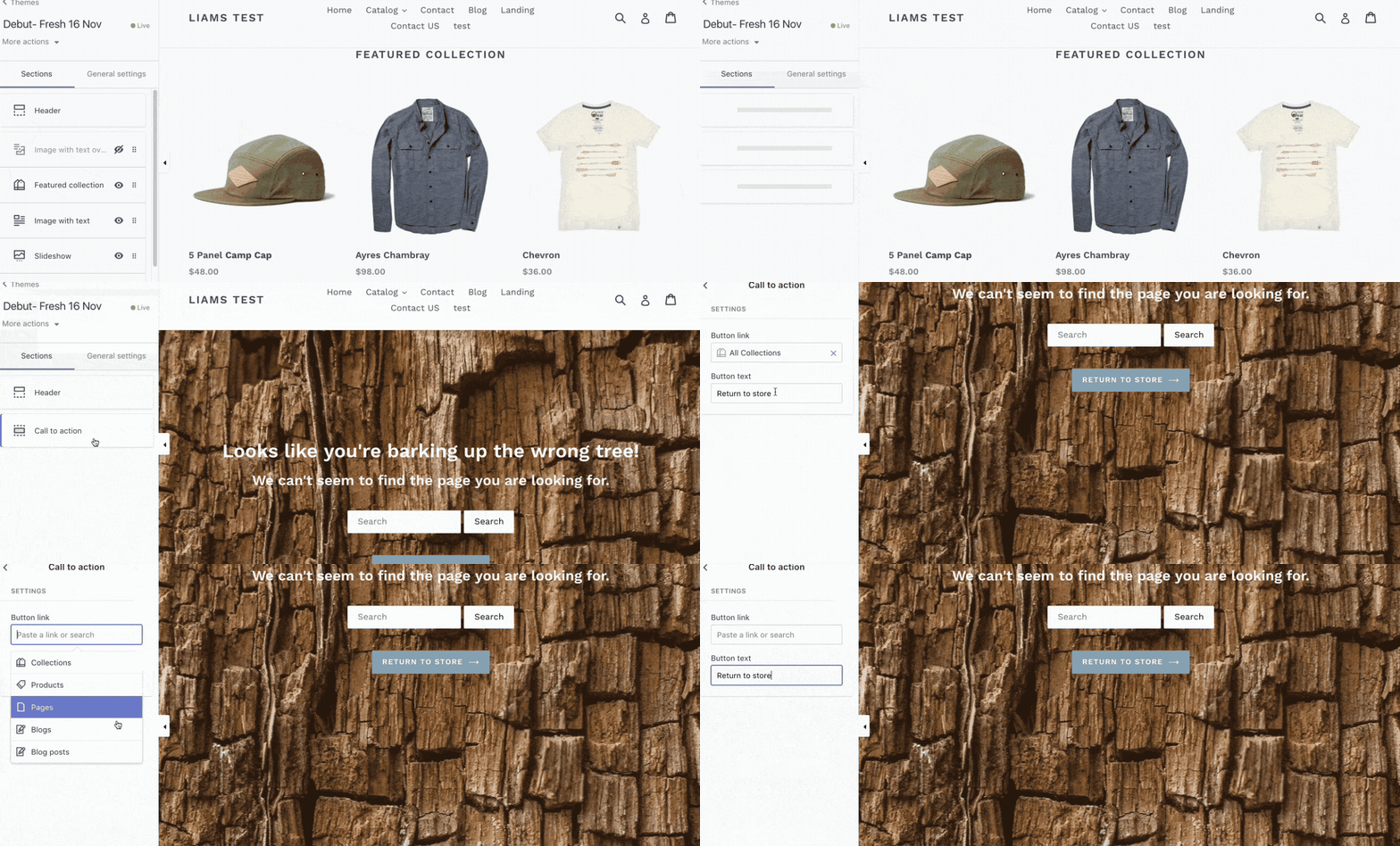
Sometimes a client may want to direct a customer to a specific page or collection, once they land on a 404 page. A customizable call-to-action button is an ideal way to funnel a customer towards a specific page, so adding a static section that allows this can empower clients to take control of their store.
First you’ll need to create a new empty Liquid file in the sections folder of your theme, called 404-call-to-action.liquid. Then add this code to the file:
| <div id="section-cta"> | |
| <a href="{{ section.settings.link }}" class="btn btn--has-icon-after" id="btn-404">{{ section.settings.linktext }}{% include 'icon-arrow-right' %}</a> | |
| </div> | |
| {% schema %} | |
| { | |
| "name": "Call to action", | |
| "settings": [ | |
| { | |
| "id": "link", | |
| "type": "url", | |
| "label": "Button link" | |
| }, | |
| { | |
| "id": "linktext", | |
| "type": "text", | |
| "label": "Button text", | |
| "default": "Return to Store" | |
| } | |
| ] | |
| } | |
| {% endschema %} | |
| {% stylesheet %} | |
| {% endstylesheet %} | |
| {% javascript %} | |
| {% endjavascript %} |
Next, you’ll need to include this new section in your 404.liquid template file, in the position where you would like the call-to-action button to appear. You will want to use a Liquid theme tag {% section "404-call-to-action" %} to include this section, and in my case, my 404.liquid template file looks like this:
| {% layout "404-layout" %} | |
| <div id="custom-404-page"> | |
| <div class="page-width"> | |
| <div class="empty-page-content text-center"> | |
| <h1>{{ 'general.404.title' | t }}</h1> | |
| <h3>{{ 'general.404.subtext' | t }}</h3> | |
| <div> | |
| <form class="search" action="/search"> | |
| <input type="text" placeholder="Search" name="q" value="{{ search.terms | escape }}" /> | |
| <input type="submit" value="Search" /> | |
| </form> | |
| </div> | |
| {% section "404-call-to-action" %} | |
| </div> | |
| </div> | |
| </div> |
Now, when you open the Theme Customizer and load a page that doesn't exist, you’ll see an option to edit a call-to-action button. These changes that you make on the Theme Customizer, will now apply to any 404 error page.

What error?
These are just some of the ways you can improve the standard Shopify 404 error page, and I’d encourage you to craft your pages around the unique characteristics of your clients.
By thinking outside the box, you can create an opportunity for your clients to turn a possible loss into a win, and even drive sales with 404 error pages. Your clients will want their brand to stand out at every point in the customer journey, so error pages should not be overlooked. Hopefully with the help of this article, you’ll be able to add extra value to your projects.
Have you experimented with different styles to develop functional and fun 404 error pages? We would love to hear about your experiences in the comments below!
Read more
- What is a Canonical URL? Best Practice Guide 2022
- How to Use Liquid to Create Custom Landing Page Templates
- How the Routes and Page_Image Liquid Objects Can Help You Build More Robust Themes
- How to Work With Shopify Theme Blocks
- How to Customize the img Element in Shopify Themes
- How to use Liquid to Customize Shopify Theme Blog Templates
- 10 Essential Front-End Developer Skills to Help You Move Faster in Your Career
- 5 Easy-to-Implement Website Maintenance Tips for Your Client's Ecommerce Business
- Getting the Most Out of Chrome Developer Tools: 4 Modern Features You Need to Know
- How to Get Published in the Shopify Theme Store

