Announcing Online Store 2.0
Online Store 2.0 is an end-to-end overhaul of how themes are built at Shopify, launched June 2021. While the information in the following article is still correct, it doesn't account for Online Store 2.0 best practices, and may not include references to recent features or functionality. To learn more about how to build with Online Store 2.0, visit our updated documentation.
Visit docsVery often, clients will want to highlight the businesses that they deal with and assert themselves as being trustworthy and in-demand. One of the easiest ways to achieve this effect is with the use of a logo bar on their website that displays the companies your clients have worked with.
As we learned in a previous Web Design and Development Blog post focused on social proof:
“Out of all the forms of social proof, perhaps none is as immediately impactful as including brand logos in the design of your ecommerce homepage.”
A highly visible, deliberately placed logo bar establishes credibility for your clients, and allows for brand storytelling through imagery, rather than text.
Logo bars can also be used on your own developer portfolio sites, as visual indicators of the services you provide. Theme developers, Maestrooo, use this technique to great effect on their site, displaying the different aspects of development they can assist with.

In this article, I’ll demonstrate how to use Liquid to build a dynamic logo bar section, extending the functionality of your custom themes, or bespoke client work. I’ll also look at how Liquid’s section settings can be leveraged to allow customizable options, which empowers clients to personalize their online store.
Creating a custom logo bar section
Here are the steps to follow to create a custom logo bar section.
1. Decide on what type of elements will be in the section
The first step when creating a logo list is to decide what types of elements we would like to contain in this section. Depending on your client’s requirements you may need text, headings, or other input settings.
In this example, I’d like to include a section heading, and allow for hyperlinks to be associated with logo images. By using Liquid’s section objects, we can create settings which can be accessed from the Theme Editor to assign the heading text, link URLs, and choose which images we would like to appear.
Creating the heading text for our section is straightforward and demonstrates how we can link Liquid objects to section settings. For example, we can write markdown, which appears like this:
<h2>{{ section.settings.title | escape }}</h2>
Here we’re using the section object to create a property with the ID of title. When we create settings within the schema tags of the section, we can reference this ID and assign a specific type to this property. In this case, we would like this to be a text box, so the type we assign is text. Once this is configured within the schema array, it would look like this:
{
"type": "text",
"id": "title",
"label": "Heading",
"default": "Logo list"
}
Later when the section is set up correctly, clients will be able to navigate to the Theme Editor and assign a heading to this section. The heading will be a <h2> header and the escape Liquid filter is used to ensure the output will be outputted correctly.
2. Build the code that displays the images
Next we’ll need to use a mixture of Liquid logic tags, HTML, and block settings to build the code that displays the images themselves.
Since our logos will be blocks—meaning the images can be moved around within the section, as well as added and removed—we’ll be looping through section.blocks in order to output the block content. The whole for loop containing the logos can appear like this:
| <ul> | |
| {% for block in section.blocks %} | |
| <li class="logo-bar-section" {{ block.shopify_attributes }}> | |
| {% if block.settings.link != blank %} | |
| <a href="{{ block.settings.link }}"> | |
| {% endif %} | |
| {% if block.settings.image != blank %} | |
| {{ block.settings.image | img_url: '150x150', scale: 2 | img_tag: block.settings.image.alt, 'logo-bar__image' }} | |
| {% else %} | |
| {{ 'logo' | placeholder_svg_tag: 'placeholder-svg' }} | |
| {% endif %} | |
| {% if block.settings.link != blank %} | |
| </a> | |
| {% endif %} | |
| </li> | |
| {% endfor %} | |
| </ul> |
view rawlogo-bar-section-blocks-loop.liquid hosted with ❤ by GitHub
Within the for loop, we see that each logo block will be a list item and the {{ block.shopify_attributes }} property is used by the Theme Editor to identify blocks and listen for events.
You might also like: How to Use Product Media on Your Custom Shopify Themes.
Similar to how the header was referenced within the schema tags earlier, we can use the block.settings property to create setting values by referencing the block's unique ID. For our purposes, the two key properties here are block.settings.link and block.settings.image, and the IDs we’ll reference are link and image.
When these properties are referenced within the schema tags of the section, and assigned the appropriate type, it will be possible for clients to upload images from the Theme Editor, as well as enter a URL that the image should link to. In this case, the array for the blocks would look like this:
| "blocks": [ | |
| { | |
| "type": "logo_image", | |
| "name": "Logo", | |
| "settings": [ | |
| { | |
| "type": "image_picker", | |
| "id": "image", | |
| "label": "Image" | |
| }, | |
| { | |
| "type": "url", | |
| "id": "link", | |
| "label": "Link", | |
| "info": "Optional" | |
| } | |
| ] | |
| } |
view rawlogo-bar-section-setting.json hosted with ❤ by GitHub
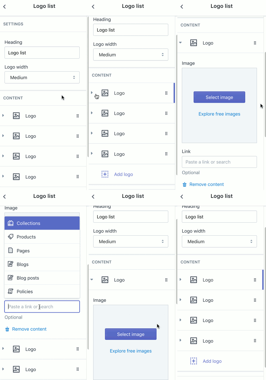
As we can see above, the IDs we have used within the list item, image and link, are associated with two block settings with types of image_picker and url. This will output as two separate settings for each specific logo block that’s added to the section. You can see how that would look like to a client below:

Since I'd like this section to be available from the home page, I'm going to add presets to the end to the schema array. When presets are present in a section, the Theme Editor recognizes that this section is a dynamic section and can be added to the home page.
Within the presets, I can assign a name for this section, and indicate which category this section should appear in. I can also set a default number of empty logo blocks that should appear, by adding in a separate array for each block. In this case, I’ll add in four empty blocks.
| "presets": [ | |
| { | |
| "name": "Logo list", | |
| "category": "Image", | |
| "blocks": [ | |
| { | |
| "type": "logo_image" | |
| }, | |
| { | |
| "type": "logo_image" | |
| }, | |
| { | |
| "type": "logo_image" | |
| }, | |
| { | |
| "type": "logo_image" | |
| } | |
| ] | |
| } | |
| ] |
3. Create a section allowing clients to adjust the logos’ sizes
Finally, we want to create a section setting that allows clients to adjust the size of the logos straight from the Theme Editor. To achieve this, we can link a section object with a CSS value within the section.
For example, my list item has a class of logo-bar-section, and if I add <style> tags within this section, I can add styles to this class. By assigning a Liquid section settings object as the value of max-width, I can create a variable which is controlled by section settings.
The styling within the section can appear like this:
<style>
.logo-bar-section {
 max-width: {{ section.settings.logo_width }};
 display: inline-block;
}
</style>
This means now that the value of max-width is determined by a Liquid section setting variable, and I can set up possible parameters within the section’s <schema> array. The ID for this section setting is logo_width, and I can use this ID to reference the section setting. Within the same array, I can define what type of setting it is, and specify what options are available.
When this is all set up within the schema tags, the array can appear like this:
| { | |
| "type": "select", | |
| "id": "logo_width", | |
| "label": "Logo width", | |
| "default": "150px", | |
| "options": [ | |
| { | |
| "label": "Extra Small", | |
| "value": "100px" | |
| }, | |
| { | |
| "label": "Small", | |
| "value": "125px" | |
| }, | |
| { | |
| "label": "Medium", | |
| "value": "150px" | |
| }, | |
| { | |
| "label": "Large", | |
| "value": "175px" | |
| }, | |
| { | |
| "label": "Extra Large", | |
| "value": "200px" | |
| } | |
| ] | |
| } |
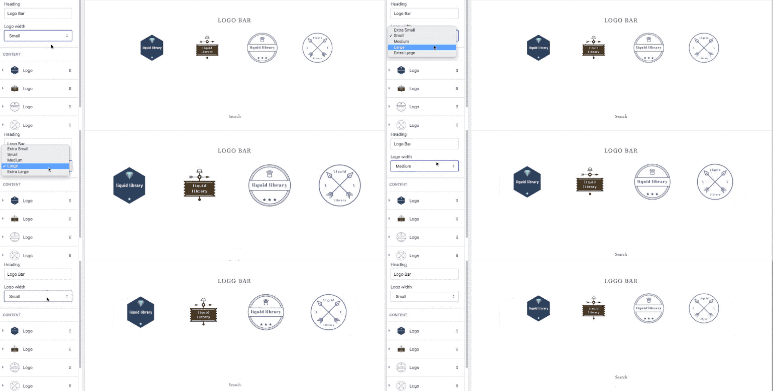
Here we're referencing the section setting object with an ID of "logo_width" which we can then assign different properties to. In this case, I’m choosing a type of select, which generates a drop down box, where there are four available options, ranging from “Extra Small” to “Extra Large”.
You might also like: How to Optimize Your Clients’ Themes to Sell Digital Products.
The different options have labels, which appear on the Theme Editor, and pixel values, which are assigned to the associated CSS value when a specific option is selected. Now, when a client is customizing their logo bar, and selects “Large”, the value of 200px is assigned to the max-width property of the logo-bar-section list item.

Once we are finished, the entire section would appear like this:
| <style> | |
| .logo-bar-section { | |
| max-width: {{ section.settings.logo_width }}; | |
| display: inline-block; | |
| margin: 0 27.5px 35px; | |
| text-align: center; | |
| } | |
| </style> | |
| <div> | |
| <h2>{{ section.settings.title | escape }}</h2> | |
| {% if section.blocks.size > 0 %} | |
| <ul> | |
| {% for block in section.blocks %} | |
| <li class="logo-bar-section" {{ block.shopify_attributes }}> | |
| {% if block.settings.link != blank %} | |
| <a href="{{ block.settings.link }}"> | |
| {% endif %} | |
| {% if block.settings.image != blank %} | |
| {{ block.settings.image | img_url: '150x150', scale: 2 | img_tag: block.settings.image.alt, 'logo-bar__image' }} | |
| {% else %} | |
| {{ 'logo' | placeholder_svg_tag: 'placeholder-svg' }} | |
| {% endif %} | |
| {% if block.settings.link != blank %} | |
| </a> | |
| {% endif %} | |
| </li> | |
| {% endfor %} | |
| </ul> | |
| {% endif %} | |
| </div> | |
| {% schema %} | |
| { | |
| "name": "Logo list", | |
| "class": "index-section", | |
| "max_blocks": 10, | |
| "settings": [ | |
| { | |
| "type": "text", | |
| "id": "title", | |
| "label": "Heading", | |
| "default": "Logo list" | |
| }, | |
| { | |
| "type": "select", | |
| "id": "logo_width", | |
| "label": "Logo width", | |
| "default": "150px", | |
| "options": [ | |
| { | |
| "label": "Extra Small", | |
| "value": "100px" | |
| }, | |
| { | |
| "label": "Small", | |
| "value": "125px" | |
| }, | |
| { | |
| "label": "Medium", | |
| "value": "150px" | |
| }, | |
| { | |
| "label": "Large", | |
| "value": "175px" | |
| }, | |
| { | |
| "label": "Extra Large", | |
| "value": "200px" | |
| } | |
| ] | |
| } | |
| ], | |
| "blocks": [ | |
| { | |
| "type": "logo_image", | |
| "name": "Logo", | |
| "settings": [ | |
| { | |
| "type": "image_picker", | |
| "id": "image", | |
| "label": "Image" | |
| }, | |
| { | |
| "type": "url", | |
| "id": "link", | |
| "label": "Link", | |
| "info": "Optional" | |
| } | |
| ] | |
| } | |
| ], | |
| "presets": [ | |
| { | |
| "name": "Logo list", | |
| "category": "Image", | |
| "blocks": [ | |
| { | |
| "type": "logo_image" | |
| }, | |
| { | |
| "type": "logo_image" | |
| }, | |
| { | |
| "type": "logo_image" | |
| }, | |
| { | |
| "type": "logo_image" | |
| } | |
| ] | |
| } | |
| ] | |
| } | |
| {% endschema %} | |
Now, when your clients are uploading a logo, they will be able to add a heading title, attach a hyperlink to the logo, and adjust the sizes of the logo. You can also get creative with other customizations, like adding a text overlay or a background color to the logo section.
You might also like: Understanding hreflang Tags for Multilingual Stores.
Connecting with logos
Creating a striking and well-positioned logo bar can highlight the various brands your clients work with, and boost their conversions by improving their social proof. As we’ve seen, theme sections can be leveraged to create intuitive logo bars that your clients can customize.
If you’re also designing logos for your clients, Hatchful is a really useful logo generator to consider. Hatchful is a mobile app built by Shopify for iOS and Android that helps you build a visual identity from scratch and right from the palm of your hand.
From there, you can customize your brand’s colors and fonts, and download all of the brand assets your clients need, including perfectly-sized images for all of their social media platforms.
Regardless of how you use logos in your custom theme builds, there’s no doubt that they’re a powerful tool for connecting with brands and customers. Hopefully with the help of this article, adding that extra value for clients will be a little bit easier with a logo bar.
Read more
- Everything You Always Wanted to Know About Rapid Prototyping
- How to Customize Content by Country with Shopify
- 10 Beautiful Ecommerce Website Color Schemes
- How to Build a Shopify App: The Complete Guide
- Top Tips for Building Themes That Are Fully Featured, Like Customizing Shopify’s Best Free Themes
- How to Use Liquid to Create Custom Landing Page Templates
- How to Use Shopify Theme Settings to Create Mobile-Specific Logos
- An Overview of Liquid: Shopify's Templating Language
- Shopify’s Buy Button 101: How to Use BuyButton.js in a WordPress Theme
- How to Test your Theme Before Submitting to the Shopify Theme Store
Have you created a logo bar before? Let us know in the comments below.

